
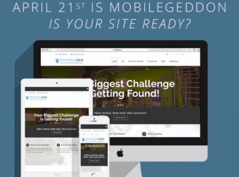
On February 26, 2015 Google formally announced an important change that will affect how your business appears in Google mobile search engine rankings. Some internet marketing experts are calling this “mobilegeddon”, as they expect this update will negatively affect a significant number of websites.
Starting April 21, we will be expanding our use of mobile-friendliness as a ranking signal. This change will affect mobile searches in all languages worldwide and will have a significant impact in our search results.
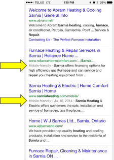
For several months now Google has been labeling websites in their mobile search engine results pages as “Mobile-friendly”. The intent of this label is to allow users to find relevant, high-quality search results that are optimized for the device (desktop, smartphone or tablet) they are using.
Starting on April 21, Google has announced it will begin using “mobile-friendliness” as a ranking signal for websites. This means search engine rankings may increase for websites that are mobile-friendly and drop for websites that are non-mobile-friendly.
What does this mean for my website?
This recent announcement by Google suggests that it will be very important for your business’ search engine rankings to have a “mobile-friendly” website.
If you already have a mobile website or your website uses mobile-friendly responsive design, your rankings are likely to improve or remain unchanged after April 21.
However, if you do not have a mobile or responsive site, these changes may cause your website to drop in search engine rankings, especially if your competitors do have a mobile or responsive website.
What is “Mobile-friendly”?
A mobile-friendly website is a site that makes it easy to view, navigate and complete tasks while on a mobile device or tablet. Google’s “Mobile-friendly” label is based on factors such as the size of text (when displayed on a mobile device), the ability to use touch to navigate (links are not too close together), and page loading speeds.
As a quick test, do a google search for your company name or a search term that you know you rank for, and check if your website has the mobile friendly label next to it. Google also has several tools you can use to check if your website is optimized for a mobile experience. These tools will provide suggestions on how to improve you website’s performance and search engine rankings.
1. Google Mobile-Friendly Test
2. Google Page Speed Insights
How does this affect search engine rankings?
Google uses a wide variety of ranking signals to determine the order of the search engine results. Ranking signals include things like on-page keyword use, content length, domain trust and number of linking domains. It is important to remember that your website is ranked on a large number of ranking signals, not one single factor. This announcement suggests that, all other things being equal, the businesses with mobile-friendly websites will rank higher in the search results than business who do not have mobile-friendly websites.
For example:
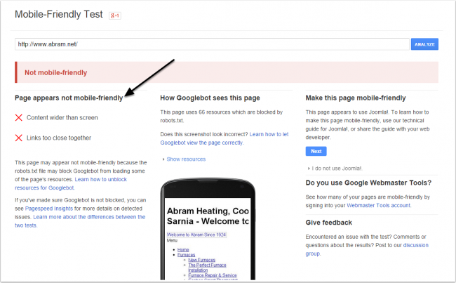
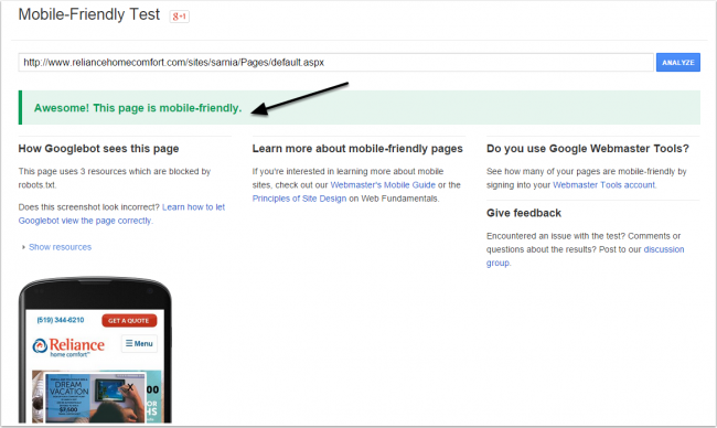
If Abram Heating & Cooling and Reliance Home Comfort are equal in all other Google search engine ranking factors, this announcement by Google suggests that as of April 21st, Reliance Home Comfort will rank higher than Abram because it is considered “mobile-friendly”.
My website is not “Mobile-Friendly”. What do I do?
1. First of all if you have been considering a switch to a mobile site or a website theme with responsive design now is the time to do it.
Mobile online traffic is quickly outpacing traffic from desktop devices (Learn More). We are also seeing many of our clients’ websites get more than half their monthly traffic from mobile devices. In addition to the effect on your search engine rankings, if you are not capitalizing on your mobile traffic with a “mobile-friendly” website, you are missing out on potential new business.
2. If a website re-design is not an option, consider small changes that may make your website more friendly to mobile users.
- Remove software that is not compatible with mobile devices (like Flash)
- Increase your font size so text can be read without zooming
- Minimize the size of your image files so they load quickly. If a page has many images, consider removing some to increase page load times
- Increase the spacing between your links so they can be easily tapped
- Make sure your key feature(s) and a call to action appear near the top of your page content so it can be seen without scrolling on a mobile device
- Avoid putting important text in images
The growing importance of local mobile search traffic combined with Google’s growing emphasis on mobile-friendly websites in the search results means this announcement is not to be ignored. If you need more information about how to get your website ready for “mobilegeddon” register for a free mobile audit using the form below, or contact us at 647-361-5142 to book an appointment.